
“Believe that you can and you’re halfway there”
– Theodore Roosevelt

Blog

 Style sheets represent a major breakthrough for Web page designers, expanding their ability to improve the appearance of their pages. In the scientific environments in which the Web was conceived, people are more concerned with the content of their documents than the presentation. As people from wider walks of life discovered the Web, the limitations of HTML became a source of continuing frustration and authors were forced to sidestep HTML’s stylistic limitations. While the intentions have been good — to improve the presentation of Web pages — the techniques for doing so have had unfortunate side effects. These techniques work for some of the people, some of the time, but not for all of the people, all of the time. They include:
These techniques considerably increase the complexity of Web pages, offer limited flexibility, suffer from interoperability problems, and create hardships for people with disabilities.
Style sheets solve these problems at the same time they supersede the limited range of presentation mechanisms in HTML. Style sheets make it easy to specify the amount of white space between text lines, the amount lines are indented, the colors used for the text and the backgrounds, the font size and style, and a host of other details.
For example, the following short CSS style sheet (stored in the file “special.css”), sets the text color of a paragraph to green and surrounds it with a solid red border:
P.special {
color : green;
border: solid red;
}
Authors may link this style sheet to their source HTML document with the LINK element:
<!DOCTYPE HTML PUBLIC "-//W3C//DTD HTML 4.01//EN"
   "http://www.w3.org/TR/html4/strict.dtd">
<HTML>
  <HEAD>
    <LINK href="special.css" rel="stylesheet" type="text/css">
  </HEAD>
  <BODY>
    <P>This paragraph should have special green text.
  </BODY>
</HTML>
HTML 4 provides support for the following style sheet features:
Note. The sample default style sheet for HTML 4 that is included in [CSS2] expresses generally accepted default style information for each element. Authors and implementors alike might find this a useful resource.
HTML documents may contain style sheet rules directly in them or they may import style sheets.
Any style sheet language may be used with HTML. A simple style sheet language may suffice for the needs of most users, but other languages may be more suited to highly specialized needs. This specification uses the style language “Cascading Style Sheets” ([CSS1]), abbreviated CSS, for examples.
The syntax of style data depends on the style sheet language.
Authors must specify the style sheet language of style information associated with an HTML document.
Authors should use the META element to set the default style sheet language for a document. For example, to set the default to CSS, authors should put the following declaration in the HEAD of their documents:
<META http-equiv="Content-Style-Type" content="text/css">
The default style sheet language may also be set with HTTP headers. The above META declaration is equivalent to the HTTP header:
Content-Style-Type: text/css
User agents should determine the default style sheet language for a document according to the following steps (highest to lowest priority):
Documents that include elements that set the style attribute but which don’t define a default style sheet language are incorrect. Authoring tools should generate default style sheet language information (typically a META declaration) so that user agents do not have to rely on a default of “text/css”.
Attribute definitions
The syntax of the value of the style attribute is determined by the default style sheet language. For example, for [[CSS2]] inline style, use the declaration block syntax described in section 4.1.8 (without curly brace delimiters).
This CSS example sets color and font size information for the text in a specific paragraph.
<P style="font-size: 12pt; color: fuchsia">Aren't style sheets wonderful?
In CSS, property declarations have the form “name : value” and are separated by a semi-colon.
To specify style information for more than one element, authors should use the STYLE element. For optimal flexibility, authors should define styles in external style sheets.
<!ELEMENT STYLE - - %StyleSheet        -- style info -->
<!ATTLIST STYLE
  %i18n;                               -- lang, dir, for use with title --
  type        %ContentType;  #REQUIRED -- content type of style language --
  media       %MediaDesc;    #IMPLIED  -- designed for use with these media --
  title       %Text;         #IMPLIED  -- advisory title --
  >
Start tag: required, End tag: required
Attribute definitions
Attributes defined elsewhere
The STYLE element allows authors to put style sheet rules in the head of the document. HTML permits any number of STYLE elements in the HEAD section of a document.
User agents that don’t support style sheets, or don’t support the specific style sheet language used by a STYLE element, must hide the contents of the STYLE element. It is an error to render the content as part of the document’s text. Some style sheet languages support syntax for hiding the content from non-conforming user agents.
The syntax of style data depends on the style sheet language.
Some style sheet implementations may allow a wider variety of rules in the STYLE element than in the style attribute. For example, with CSS, rules may be declared within a STYLE element for:
Rules for style rule precedences and inheritance depend on the style sheet language.
The following CSS STYLE declaration puts a border around every H1 element in the document and centers it on the page.
<HEAD>
 <STYLE type="text/css">
   H1 {border-width: 1; border: solid; text-align: center}
 </STYLE>
</HEAD>
To specify that this style information should only apply to H1 elements of a specific class, we modify it as follows:
<HEAD>
 <STYLE type="text/css">
   H1.myclass {border-width: 1; border: solid; text-align: center}
 </STYLE>
</HEAD>
<BODY>
 <H1> This H1 is affected by our style </H1>
 <H1> This one is not affected by our style </H1>
</BODY>
Finally, to limit the scope of the style information to a single instance of H1, set the id attribute:
<HEAD>
 <STYLE type="text/css">
   #myid {border-width: 1; border: solid; text-align: center}
 </STYLE>
</HEAD>
<BODY>
 <H1> This H1 is not affected </H1>
 <H1 id="myid"> This H1 is affected by style </H1>
 <H1> This H1 is not affected </H1>
</BODY>
Although style information may be set for almost every HTML element, two elements, DIV and SPAN, are particularly useful in that they do not impose any presentation semantics (besides block-level vs. inline). When combined with style sheets, these elements allow users to extend HTML indefinitely, particularly when used with the class and id attributes.
In the following example, we use the SPAN element to set the font style of the first few words of a paragraph to small caps.
<HEAD>
 <STYLE type="text/css">
  SPAN.sc-ex { font-variant: small-caps }
 </STYLE>
</HEAD>
<BODY>
  <P><SPAN>The first</SPAN> few words of
  this paragraph are in small-caps.
</BODY>
In the following example, we use DIV and the class attribute to set the text justification for a series of paragraphs that make up the abstract section of a scientific article. This style information could be reused for other abstract sections by setting the class attribute elsewhere in the document.
<HEAD>
 <STYLE type="text/css">
   DIV.Abstract { text-align: justify }
 </STYLE>
</HEAD>
<BODY>
 <DIV>
   <P>The Chieftain product range is our market winner for
     the coming year. This report sets out how to position
     Chieftain against competing products.

   <P>Chieftain replaces the Commander range, which will
     remain on the price list until further notice.
 </DIV>
</BODY>
HTML allows authors to design documents that take advantage of the characteristics of the media where the document is to be rendered (e.g., graphical displays, television screens, handheld devices, speech-based browsers, braille-based tactile devices, etc.). By specifying the media attribute, authors allow user agents to load and apply style sheets selectively. Please consult the list of recognized media descriptors.
The following sample declarations apply to H1 elements. When projected in a business meeting, all instances will be blue. When printed, all instances will be centered.
<HEAD>
 <STYLE type="text/css" media="projection">
    H1 { color: blue}
 </STYLE>

 <STYLE type="text/css" media="print">
   H1 { text-align: center }
 </STYLE>
This example adds sound effects to anchors for use in speech output:
 <STYLE type="text/css" media="aural">
   A { cue-before: uri(bell.aiff); cue-after: uri(dong.wav)}
 </STYLE>
</HEAD>
Media control is particularly interesting when applied to external style sheets since user agents can save time by retrieving from the network only those style sheets that apply to the current device. For instance, speech-based browsers can avoid downloading style sheets designed for visual rendering. See the section on media-dependent cascades for more information.
Authors may separate style sheets from HTML documents. This offers several benefits:
HTML allows authors to associate any number of external style sheets with a document. The style sheet language defines how multiple external style sheets interact (for example, the CSS “cascade” rules).
Authors may specify a number of mutually exclusive style sheets called alternate style sheets. Users may select their favorite among these depending on their preferences. For instance, an author may specify one style sheet designed for small screens and another for users with weak vision (e.g., large fonts). User agents should allow users to select from alternate style sheets.
The author may specify that one of the alternates is a preferred style sheet. User agents should apply the author’s preferred style sheet unless the user has selected a different alternate.
Authors may group several alternate style sheets (including the author’s preferred style sheets) under a single style name. When a user selects a named style, the user agent must apply all style sheets with that name. User agents must not apply alternate style sheets with a different style name. The section on specifying external style sheets explains how to name a group of style sheets.
Authors may also specify persistent style sheets that user agents must apply in addition to any alternate style sheet.
User agents must respect media descriptors when applying any style sheet.
User agents should also allow users to disable the author’s style sheets entirely, in which case the user agent must not apply any persistent or alternate style sheets.
Authors specify external style sheets with the following attributes of the LINK element:
User agents should provide a means for users to view and pick from the list of alternate styles. The value of the title attribute is recommended as the name of each choice.
In this example, we first specify a persistent style sheet located in the file mystyle.css:
<LINK href="mystyle.css" rel="stylesheet" type="text/css">
Setting the title attribute makes this the author’s preferred style sheet:
<LINK href="mystyle.css" title="compact" rel="stylesheet" type="text/css">
Adding the keyword “alternate” to the rel attribute makes it an alternate style sheet:
<LINK href="mystyle.css" title="Medium" rel="alternate stylesheet" type="text/css">
For more information on external style sheets, please consult the section on links and external style sheets.
Authors may also use the META element to set the document’s preferred style sheet. For example, to set the preferred style sheet to “compact” (see the preceding example), authors may include the following line in the HEAD:
<META http-equiv="Default-Style" content="compact">
The preferred style sheet may also be specified with HTTP headers. The above META declaration is equivalent to the HTTP header:
Default-Style: "compact"
If two or more META declarations or HTTP headers specify the preferred style sheet, the last one takes precedence. HTTP headers are considered to occur earlier than the document HEAD for this purpose.
If two or more LINK elements specify a preferred style sheet, the first one takes precedence.
Preferred style sheets specified with META or HTTP headers have precedence over those specified with the LINK element.
Cascading style sheet languages such as CSS allow style information from several sources to be blended together. However, not all style sheet languages support cascading. To define a cascade, authors specify a sequence of LINK and/or STYLE elements. The style information is cascaded in the order the elements appear in the HEAD.
Note. This specification does not specify how style sheets from different style languages cascade. Authors should avoid mixing style sheet languages.
In the following example, we specify two alternate style sheets named “compact”. If the user selects the “compact” style, the user agent must apply both external style sheets, as well as the persistent “common.css” style sheet. If the user selects the “big print” style, only the alternate style sheet “bigprint.css” and the persistent “common.css” will be applied.
<LINK rel="alternate stylesheet" title="compact" href="small-base.css" type="text/css">
<LINK rel="alternate stylesheet" title="compact" href="small-extras.css" type="text/css">
<LINK rel="alternate stylesheet" title="big print" href="bigprint.css" type="text/css">
<LINK rel="stylesheet" href="common.css" type="text/css">
Here is a cascade example that involves both the LINK and STYLE elements.
<LINK rel="stylesheet" href="corporate.css" type="text/css">
<LINK rel="stylesheet" href="techreport.css" type="text/css">
<STYLE type="text/css">
    p.special { color: rgb(230, 100, 180) }
</STYLE>
A cascade may include style sheets applicable to different media. Both LINK and STYLE may be used with the media attribute. The user agent is then responsible for filtering out those style sheets that do not apply to the current medium.
In the following example, we define a cascade where the “corporate” style sheet is provided in several versions: one suited to printing, one for screen use and one for speech-based browsers (useful, say, when reading email in the car). The “techreport” stylesheet applies to all media. The color rule defined by the STYLE element is used for print and screen but not for aural rendering.
<LINK rel="stylesheet" media="aural" href="corporate-aural.css" type="text/css">
<LINK rel="stylesheet" media="screen" href="corporate-screen.css" type="text/css">
<LINK rel="stylesheet" media="print" href="corporate-print.css" type="text/css">
<LINK rel="stylesheet" href="techreport.css" type="text/css">
<STYLE media="screen, print" type="text/css">
    p.special { color: rgb(230, 100, 180) }
</STYLE>
When the user agent wants to render a document, it needs to find values for style properties, e.g. the font family, font style, size, line height, text color and so on. The exact mechanism depends on the style sheet language, but the following description is generally applicable:
The cascading mechanism is used when a number of style rules all apply directly to an element. The mechanism allows the user agent to sort the rules by specificity, to determine which rule to apply. If no rule can be found, the next step depends on whether the style property can be inherited or not. Not all properties can be inherited. For these properties the style sheet language provides default values for use when there are no explicit rules for a particular element.
If the property can be inherited, the user agent examines the immediately enclosing element to see if a rule applies to that. This process continues until an applicable rule is found. This mechanism allows style sheets to be specified compactly. For instance, authors may specify the font family for all elements within the BODY by a single rule that applies to the BODY element.
Some style sheet languages support syntax intended to allow authors to hide the content of STYLE elements from non-conforming user agents.
This example illustrates for CSS how to comment out the content of STYLE elements to ensure that older, non-conforming user agents will not render them as text.
<STYLE type="text/css">
<!--
   H1 { color: red }
   P  { color: blue}
   -->
</STYLE>
This section only applies to user agents conforming to versions of HTTP that define a Link header field. Note that HTTP 1.1 as defined by [RFC2616] does not include a Link header field (refer to section 19.6.3).
Web server managers may find it convenient to configure a server so that a style sheet will be applied to a group of pages. The HTTP Link header has the same effect as a LINK element with the same attributes and values. Multiple Link headers correspond to multiple LINK elements occurring in the same order. For instance,
Link: <http://www.acme.com/corporate.css>; REL=stylesheet
corresponds to:
<LINK rel="stylesheet" href="http://www.acme.com/corporate.css">
It is possible to specify several alternate styles using multiple Link headers, and then use the rel attribute to determine the default style.
In the following example, “compact” is applied by default since it omits the “alternate” keyword for the rel attribute.
Link: <compact.css>; rel="stylesheet"; title="compact"
Link: <bigprint.css>; rel="alternate stylesheet"; title="big print"
This should also work when HTML documents are sent by email. Some email agents can alter the ordering of [RFC822] headers. To protect against this affecting the cascading order for style sheets specified by Link headers, authors can use header concatenation to merge several instances of the same header field. The quote marks are only needed when the attribute values include whitespace. Use SGML entities to reference characters that are otherwise not permitted within HTTP or email headers, or that are likely to be affected by transit through gateways.

 Vehicle Wraps is the marketing practice of completely or partially covering (wrapping) a vehicle in an advertisement or livery; a mobile billboard is the outcome of the process. Wrap advertising can be achieved by painting onto a vehicle’s outer surface, but an increasingly ubiquitous practice in the 21st century involves the use of large vinyl sheets as “decals.”
The vinyl sheets can be removed with relative ease, drastically reducing the costs associated with changing advertisements. While vehicles with large, flat surfaces, such as buses and light-rail carriages, are often utilized due to ease, smaller cars consisting of curved surfaces can also serve as hosts for wrap advertising.
[g-gallery gid=”5347″]


Wrap advertising (Vehicle Wraps) is the marketing practice of completely or partially covering (wrapping) a vehicle in an advertisement or livery; a mobile billboard is the outcome of the process. Wrap advertising can be achieved by painting onto a vehicle’s outer surface, but an increasingly ubiquitous practice in the 21st century involves the use of large vinyl sheets as “decals.” The vinyl sheets can be removed with relative ease, drastically reducing the costs associated with changing advertisements. While vehicles with large, flat surfaces, such as buses and light-rail carriages, are often utilized due to ease, smaller cars consisting of curved surfaces can also serve as hosts for wrap advertising.
 Recent advancements in vinyl development have led to new types of vinyl, designed specifically for wrap advertising—this includes vinyl that feature bubble-preventing air channels and microscopic glass beads that prevent an adhesive from functioning until the user is prepared (the beads allow the material to be repeatedly lifted and reapplied during the wrapping process, without compromising the longevity of the wrap). The vinyl is heated with a heat gun or torch for the purpose of molding the material around objects.
Decals can be made to cover side and rear windows on a vehicle, though for obvious safety reasons, the front windows used by the driver are not covered. The decals on side windows are typically perforated so that it is still possible for passengers to look outside. A wrap must often be divided into a number of smaller pieces to appropriately cover any movable panels on the vehicle, such as the fuel tank cover, trunk (boot) openings, and other doors.
 Wrapping is also sometimes used instead of paint as a less-permanent way of applying its operator’s standard livery than paint. This has become particularly common in the United Kingdom where, since the privatization of British Rail, it has become quite frequent for trains to be transferred from one company to another and thus require many changes of livery. Wrapping is also used for vehicle customizing and mobile advertising. Race cars opt for vehicle wraps in that it is lighter than paint.
Industry analysts, researchers and trade representatives have researched the effectiveness of mobile billboards. Outdoor Advertising Magazine said that outdoor mobile media billboards have a 97% recall rate, and 99% of survey respondents thought mobile advertising is more effective than traditional outdoor advertising. 3M and the American Trucking Associations noted 91% of the target noticed the text and graphics on truck advertising, and the Traffic Audit Bureau noted that on local routes monthly impressions ranged from one to four millions hits. Product Acceptance and Research said 94% of respondents recalled seeing the Mobile Billboard, with 80% recalling the specific advertisement; the billboards resulted in a sales increase of 107%


![FullSizeRender[1]](http://figmentdesign.com/wp-content/uploads/2015/02/FullSizeRender1.jpg)


Hialeah Park thanks Figment Design for being part of the team that made it happen last night at the Hurricane’s game. Much appreciated!

On January 28th-30th 2015 Figment Design showcased our drone helicopters we use for Aerial Photography. CHTA (Caribbean Hotel & Tourism Association) convention in the sunny paradise of Puerto Rico. We demonstrated how Aerial Photography can exponentially improve how you show your hotels to the world.


Drones are in!


You’ve been busy creating campaign concepts, logo designs or ad copy and things are clicking and when the next job comes along you feel like your creative tank is empty. We all know and dread that this day will come. You think and think and the ideas just don’t come easily or at all. What do you do to get that creative spark back? Depending on the project you are working on, there are several things you can do to help yourself. Keep in mind this is not an exact science. One or all of these suggestions may or may not work for you or as they say… “Your mileage may vary”.
When given the assignment, if client is present or you’re working with the art director, don’t be afraid to ask questions and take good notes. Also, if you are working with a copywriter, good collaboration can make all the difference in the world. There is a great article at Roundpeg, “Help Me Help You: 5 Tips for Working with a Copywriter“ that offers great tips on the subject.
Sometimes talking about it with others can help trigger an idea. Talk with other co-workers and designers about your creative funk and be open to suggestions. If you’re a freelancer and work alone, talk with other designers you have collaborated with or friends that are designers. You never know, someone may just say that one word that triggers a spark. Friends help friends.
If sitting behind your desk staring at the screen isn’t helping you, then grab yourself a pad and a pencil. Moving away from the electronic routine is what I sometimes prefer rather than bringing along a tablet or laptop. Changing up the usual modus operandi can make you think in a different way. Go sit on the couch, go to a Starbucks, or grab some fresh air on a balcony or terrace. Just by changing your surroundings, you’ll stimulate your brain just by what you see going around you. Sometimes if things are too hectic in the office and there’s too much commotion, opt to move somewhere else. If you can’t, put on some headphones and play some music you really like to groove to. I have found that going to your local bookstore is great place for inspiration. Looking at design books or magazines can get the creative juices flowing. You might even find a new magazine you’ll want to subscribe to.
I know we are in the digital age but sometimes you can’t beat roughing out ideas or layout compositions on paper with my personal favorite… Post-its. If you have a tablet with a stylus that works too! Sometimes I might have a small kernel of an idea. I start with simple roughs of the layout and pretty soon it will snowball to several thumbnail iterations. I will take that and go back to my Mac and build on. Sometimes simpler beginnings are a better start in getting an idea to grow.
With the Internet, we have an unlimited archive within reach of our fingertips. There are hundreds and thousands of sites that can guide and inspire. They can offer great case studies of how others have tackled creative challenges. The Internet can also offer you a global perspective. The worldwide web really is worldwide and can offer ideas and suggestions from freelancers and firms from around the world. Some of my personal favorite sites are:

http://www.deviantart.com/ (Illustrations)
https://www.behance.net/ (Graphic Design, Photography, Interaction, Design, Art Direction, Illustration)
https://www.tumblr.com/ (Graphic Design, Photography, Interaction, Design, Art Direction, Illustration and more!)
http://www.adteachings.com/ (Copywriting and Print Campaigns)
http://www.aiga.org/ (American Institute of Graphic Arts)

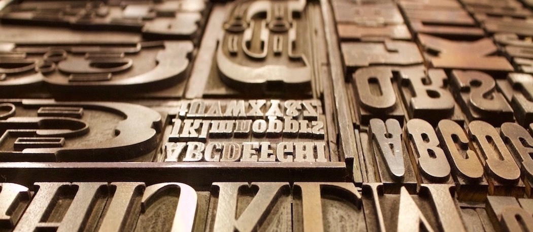 We’ve all been there before! A client has a new ad they want to run and they want you to use the same font that was used as a headline in a previous piece. The client provides an image of the prior ad but doesn’t have any of the original files for you to use. This can sometimes be a difficult task, particularly, when it’s not a commonly used font like Helvetica, Avant Garde, Times New Roman or Garamond. So how can you track down a font if you don’t have a clue as to its name? Fortunately, there are a few sites to help you with that. Check out a few examples listed below to help make your search a little easier. One thing to remember is there’s no magic bullet even with the amount of resources these sites can provide. When these sites don’t have the answer you are looking for, you may need to still scour the font collections of Google, Linotype or Adobe to name a few.
http://www.myfonts.com/WhatTheFont/
WhatTheFont is a site that will identify a font by using an image. You can upload the image or provide the url of the image. It will then take the image you provided and searches its database. It will then offer suggestions based on what it most closely matches. I have had some great success with this site and consider it my first choice. When using the site, I have found that there are several things you can do to help increase your success. It works best when the letters are spaced apart and the letters are horizontal. The more characters you can provide the better your results will be. The font image should also be sharp and without a busy background. If it is unable to locate what you are looking for, WhatTheFont has a forum. There are a number of font enthusiasts to help.
WhatFontIs is also a site that will identify a font by using an image. It works very similar to the way that WhatTheFont works. You can upload an image of the font that you need identified in a jpeg or png format or provide the url of the image. If it is unable to locate what you are looking for, the site will offer alternative options. This is where this site sets itself apart from WhatTheFont. You can set up preferences for it to suggest alternative fonts that are either free or paid or the list in its entirety.
Identifont helps you identify a font by using the process of elimination in various categories. You select your category such as finding fonts by appearance, finding fonts by name, finding fonts by similarity, finding fonts by picture or by finding designers and publishers. In the appearance category, you will be asked a series questions. For example, questions in may ask if the characters have serifs or what style is the upper-case ‘Q’ tail is. With each question and answer, the appearance category narrows down the list of possible options. With the font by name category, you will have to provide at least part of the name. With fonts by similarity, you can simply provide the name of fonts that are similar in nature. With fonts by picture, you can provide the name of a symbol or picture. Each of the categories will also provide similar alternatives during the course of your search.
http://www.linotype.com/fontidentifier/
Font Identifier, from Linotype, also works by using the process of elimination and works very much like the appearance category in Identifont. It asks a series of questions about the appearance of the font. With each question and answer, it, too, narrows down the number of possible matches. However, it does not provide samples of the possible matches during the course of questions. You have to go through the process and follow it to the end. However, there is one distinct advantage to this site. Many times, samples may only have a few letters to draw information from. This site has a feature that has the option to restrict the questioning to specific letters. This will cut the amount of questions asked and allows the user to input only the information they have with the sample at hand.

