 Style sheets represent a major breakthrough for Web page designers, expanding their ability to improve the appearance of their pages. In the scientific environments in which the Web was conceived, people are more concerned with the content of their documents than the presentation. As people from wider walks of life discovered the Web, the limitations of HTML became a source of continuing frustration and authors were forced to sidestep HTML’s stylistic limitations. While the intentions have been good — to improve the presentation of Web pages — the techniques for doing so have had unfortunate side effects. These techniques work for some of the people, some of the time, but not for all of the people, all of the time. They include:
- Using proprietary HTML extensions
- Converting text into images
- Using images for white space control
- Use of tables for page layout
- Writing a program instead of using HTML
These techniques considerably increase the complexity of Web pages, offer limited flexibility, suffer from interoperability problems, and create hardships for people with disabilities.
Style sheets solve these problems at the same time they supersede the limited range of presentation mechanisms in HTML. Style sheets make it easy to specify the amount of white space between text lines, the amount lines are indented, the colors used for the text and the backgrounds, the font size and style, and a host of other details.
For example, the following short CSS style sheet (stored in the file “special.css”), sets the text color of a paragraph to green and surrounds it with a solid red border:
P.special {
color : green;
border: solid red;
}
Authors may link this style sheet to their source HTML document with the LINK element:
<!DOCTYPE HTML PUBLIC "-//W3C//DTD HTML 4.01//EN"
   "http://www.w3.org/TR/html4/strict.dtd">
<HTML>
  <HEAD>
    <LINK href="special.css" rel="stylesheet" type="text/css">
  </HEAD>
  <BODY>
    <P>This paragraph should have special green text.
  </BODY>
</HTML>
HTML 4 provides support for the following style sheet features:
- Flexible placement of style information
- Placing style sheets in separate files makes them easy to reuse. Sometimes it’s useful to include rendering instructions within the document to which they apply, either grouped at the start of the document, or in attributes of the elements throughout the body of the document. To make it easier to manage style on a site basis, this specification describes how to use HTTP headers to set the style sheets to be applied to a document.
- Independence from specific style sheet languages
- This specification doesn’t tie HTML to any particular style sheet language. This allows for a range of such languages to be used, for instance simple ones for the majority of users and much more complex ones for the minority of users with highly specialized needs. The examples included below all use the CSS (Cascading Style Sheets) language [CSS1], but other style sheet languages would be possible.
- Cascading
- This is the capability provided by some style sheet languages such as CSS to allow style information from several sources to be blended together. These could be, for instance, corporate style guidelines, styles common to a group of documents, and styles specific to a single document. By storing these separately, style sheets can be reused, simplifying authoring and making more effective use of network caching. The cascade defines an ordered sequence of style sheets where rules in later sheets have greater precedence than earlier ones. Not all style sheet languages support cascading.
- Media dependencies
- HTML allows authors to specify documents in a media-independent way. This allows users to access Web pages using a wide variety of devices and media, e.g., graphical displays for computers running Windows, Macintosh OS, and X11, devices for television sets, specially adapted phones and PDA-based portable devices, speech-based browsers, and braille-based tactile devices.Style sheets, by contrast, apply to specific media or media groups. A style sheet intended for screen use may be applicable when printing, but is of little use for speech-based browsers. This specification allows you to define the broad categories of media a given style sheet is applicable to. This allows user agents to avoid retrieving inappropriate style sheets. Style sheet languages may include features for describing media dependencies within the same style sheet.
- Alternate styles
- Authors may wish to offer readers several ways to view a document. For instance, a style sheet for rendering compact documents with small fonts, or one that specifies larger fonts for increased legibility. This specification allows authors to specify a preferred style sheet as well as alternates that target specific users or media. User agents should give users the opportunity to select from among alternate style sheets or to switch off style sheets altogether.
- Performance concerns
- Some people have voiced concerns over performance issues for style sheets. For instance, retrieving an external style sheet may delay the full presentation for the user. A similar situation arises if the document head includes a lengthy set of style rules.The current proposal addresses these issues by allowing authors to include rendering instructions within each HTML element. The rendering information is then always available by the time the user agent wants to render each element.In many cases, authors will take advantage of a common style sheet for a group of documents. In this case, distributing style rules throughout the document will actually lead to worse performance than using a linked style sheet, since for most documents, the style sheet will already be present in the local cache. The public availability of good style sheets will encourage this effect.
14.2 Adding style to HTML
Note. The sample default style sheet for HTML 4 that is included in [CSS2] expresses generally accepted default style information for each element. Authors and implementors alike might find this a useful resource.
HTML documents may contain style sheet rules directly in them or they may import style sheets.
Any style sheet language may be used with HTML. A simple style sheet language may suffice for the needs of most users, but other languages may be more suited to highly specialized needs. This specification uses the style language “Cascading Style Sheets” ([CSS1]), abbreviated CSS, for examples.
The syntax of style data depends on the style sheet language.
14.2.1 Setting the default style sheet language
Authors must specify the style sheet language of style information associated with an HTML document.
Authors should use the META element to set the default style sheet language for a document. For example, to set the default to CSS, authors should put the following declaration in the HEAD of their documents:
<META http-equiv="Content-Style-Type" content="text/css">
The default style sheet language may also be set with HTTP headers. The above META declaration is equivalent to the HTTP header:
Content-Style-Type: text/css
User agents should determine the default style sheet language for a document according to the following steps (highest to lowest priority):
- If any META declarations specify the “Content-Style-Type”, the last one in the character stream determines the default style sheet language.
- Otherwise, if any HTTP headers specify the “Content-Style-Type”, the last one in the character stream determines the default style sheet language.
- Otherwise, the default style sheet language is “text/css”.
Documents that include elements that set the style attribute but which don’t define a default style sheet language are incorrect. Authoring tools should generate default style sheet language information (typically a META declaration) so that user agents do not have to rely on a default of “text/css”.
14.2.2 Inline style information
Attribute definitions
- style = style [CN]
- This attribute specifies style information for the current element.
The syntax of the value of the style attribute is determined by the default style sheet language. For example, for [[CSS2]] inline style, use the declaration block syntax described in section 4.1.8 (without curly brace delimiters).
This CSS example sets color and font size information for the text in a specific paragraph.
<P style="font-size: 12pt; color: fuchsia">Aren't style sheets wonderful?
In CSS, property declarations have the form “name : value” and are separated by a semi-colon.
To specify style information for more than one element, authors should use the STYLE element. For optimal flexibility, authors should define styles in external style sheets.
14.2.3 Header style information: the STYLE element
Start tag: required, End tag: required
Attribute definitions
- type = content-type [CI]
- This attribute specifies the style sheet language of the element’s contents and overrides the default style sheet language. The style sheet language is specified as a content type (e.g., “text/css”). Authors must supply a value for this attribute; there is no default value for this attribute.
- media = media-descriptors [CI]
- This attribute specifies the intended destination medium for style information. It may be a single media descriptor or a comma-separated list. The default value for this attribute is “screen”.
Attributes defined elsewhere
The STYLE element allows authors to put style sheet rules in the head of the document. HTML permits any number of STYLE elements in the HEAD section of a document.
User agents that don’t support style sheets, or don’t support the specific style sheet language used by a STYLE element, must hide the contents of the STYLE element. It is an error to render the content as part of the document’s text. Some style sheet languages support syntax for hiding the content from non-conforming user agents.
The syntax of style data depends on the style sheet language.
Some style sheet implementations may allow a wider variety of rules in the STYLE element than in the style attribute. For example, with CSS, rules may be declared within a STYLE element for:
- All instances of a specific HTML element (e.g., all P elements, all H1 elements, etc.)
- All instances of an HTML element belonging to a specific class (i.e., whose class attribute is set to some value).
- Single instances of an HTML element (i.e., whose id attribute is set to some value).
Rules for style rule precedences and inheritance depend on the style sheet language.
The following CSS STYLE declaration puts a border around every H1 element in the document and centers it on the page.
<HEAD>
 <STYLE type="text/css">
   H1 {border-width: 1; border: solid; text-align: center}
 </STYLE>
</HEAD>
To specify that this style information should only apply to H1 elements of a specific class, we modify it as follows:
<HEAD>
 <STYLE type="text/css">
   H1.myclass {border-width: 1; border: solid; text-align: center}
 </STYLE>
</HEAD>
<BODY>
 <H1> This H1 is affected by our style </H1>
 <H1> This one is not affected by our style </H1>
</BODY>
Finally, to limit the scope of the style information to a single instance of H1, set the id attribute:
<HEAD>
 <STYLE type="text/css">
   #myid {border-width: 1; border: solid; text-align: center}
 </STYLE>
</HEAD>
<BODY>
 <H1> This H1 is not affected </H1>
 <H1 id="myid"> This H1 is affected by style </H1>
 <H1> This H1 is not affected </H1>
</BODY>
Although style information may be set for almost every HTML element, two elements, DIV and SPAN, are particularly useful in that they do not impose any presentation semantics (besides block-level vs. inline). When combined with style sheets, these elements allow users to extend HTML indefinitely, particularly when used with the class and id attributes.
In the following example, we use the SPAN element to set the font style of the first few words of a paragraph to small caps.
<HEAD>
 <STYLE type="text/css">
  SPAN.sc-ex { font-variant: small-caps }
 </STYLE>
</HEAD>
<BODY>
  <P><SPAN>The first</SPAN> few words of
  this paragraph are in small-caps.
</BODY>
In the following example, we use DIV and the class attribute to set the text justification for a series of paragraphs that make up the abstract section of a scientific article. This style information could be reused for other abstract sections by setting the class attribute elsewhere in the document.
<HEAD>
 <STYLE type="text/css">
   DIV.Abstract { text-align: justify }
 </STYLE>
</HEAD>
<BODY>
 <DIV>
   <P>The Chieftain product range is our market winner for
     the coming year. This report sets out how to position
     Chieftain against competing products.

   <P>Chieftain replaces the Commander range, which will
     remain on the price list until further notice.
 </DIV>
</BODY>
14.2.4 Media types
HTML allows authors to design documents that take advantage of the characteristics of the media where the document is to be rendered (e.g., graphical displays, television screens, handheld devices, speech-based browsers, braille-based tactile devices, etc.). By specifying the media attribute, authors allow user agents to load and apply style sheets selectively. Please consult the list of recognized media descriptors.
The following sample declarations apply to H1 elements. When projected in a business meeting, all instances will be blue. When printed, all instances will be centered.
<HEAD>
 <STYLE type="text/css" media="projection">
    H1 { color: blue}
 </STYLE>

 <STYLE type="text/css" media="print">
   H1 { text-align: center }
 </STYLE>
This example adds sound effects to anchors for use in speech output:
 <STYLE type="text/css" media="aural">
   A { cue-before: uri(bell.aiff); cue-after: uri(dong.wav)}
 </STYLE>
</HEAD>
Media control is particularly interesting when applied to external style sheets since user agents can save time by retrieving from the network only those style sheets that apply to the current device. For instance, speech-based browsers can avoid downloading style sheets designed for visual rendering. See the section on media-dependent cascades for more information.
14.3 External style sheets
Authors may separate style sheets from HTML documents. This offers several benefits:
- Authors and Web site managers may share style sheets across a number of documents (and sites).
- Authors may change the style sheet without requiring modifications to the document.
- User agents may load style sheets selectively (based on media descriptions).
14.3.1 Preferred and alternate style sheets
HTML allows authors to associate any number of external style sheets with a document. The style sheet language defines how multiple external style sheets interact (for example, the CSS “cascade” rules).
Authors may specify a number of mutually exclusive style sheets called alternate style sheets. Users may select their favorite among these depending on their preferences. For instance, an author may specify one style sheet designed for small screens and another for users with weak vision (e.g., large fonts). User agents should allow users to select from alternate style sheets.
The author may specify that one of the alternates is a preferred style sheet. User agents should apply the author’s preferred style sheet unless the user has selected a different alternate.
Authors may group several alternate style sheets (including the author’s preferred style sheets) under a single style name. When a user selects a named style, the user agent must apply all style sheets with that name. User agents must not apply alternate style sheets with a different style name. The section on specifying external style sheets explains how to name a group of style sheets.
Authors may also specify persistent style sheets that user agents must apply in addition to any alternate style sheet.
User agents must respect media descriptors when applying any style sheet.
User agents should also allow users to disable the author’s style sheets entirely, in which case the user agent must not apply any persistent or alternate style sheets.
14.3.2 Specifying external style sheets
Authors specify external style sheets with the following attributes of the LINK element:
- Set the value of href to the location of the style sheet file. The value of href is a URI.
- Set the value of the type attribute to indicate the language of the linked (style sheet) resource. This allows the user agent to avoid downloading a style sheet for an unsupported style sheet language.
- Specify that the style sheet is persistent, preferred, or alternate:
- To make a style sheet persistent, set the rel attribute to “stylesheet” and don’t set the title attribute.
- To make a style sheet preferred, set the rel attribute to “stylesheet” and name the style sheet with the title attribute.
- To specify an alternate style sheet, set the rel attribute to “alternate stylesheet” and name the style sheet with the title attribute.
User agents should provide a means for users to view and pick from the list of alternate styles. The value of the title attribute is recommended as the name of each choice.
In this example, we first specify a persistent style sheet located in the file mystyle.css:
<LINK href="mystyle.css" rel="stylesheet" type="text/css">
Setting the title attribute makes this the author’s preferred style sheet:
<LINK href="mystyle.css" title="compact" rel="stylesheet" type="text/css">
Adding the keyword “alternate” to the rel attribute makes it an alternate style sheet:
<LINK href="mystyle.css" title="Medium" rel="alternate stylesheet" type="text/css">
For more information on external style sheets, please consult the section on links and external style sheets.
Authors may also use the META element to set the document’s preferred style sheet. For example, to set the preferred style sheet to “compact” (see the preceding example), authors may include the following line in the HEAD:
<META http-equiv="Default-Style" content="compact">
The preferred style sheet may also be specified with HTTP headers. The above META declaration is equivalent to the HTTP header:
If two or more META declarations or HTTP headers specify the preferred style sheet, the last one takes precedence. HTTP headers are considered to occur earlier than the document HEAD for this purpose.
If two or more LINK elements specify a preferred style sheet, the first one takes precedence.
Preferred style sheets specified with META or HTTP headers have precedence over those specified with the LINK element.
14.4 Cascading style sheets
Cascading style sheet languages such as CSS allow style information from several sources to be blended together. However, not all style sheet languages support cascading. To define a cascade, authors specify a sequence of LINK and/or STYLE elements. The style information is cascaded in the order the elements appear in the HEAD.
Note. This specification does not specify how style sheets from different style languages cascade. Authors should avoid mixing style sheet languages.
In the following example, we specify two alternate style sheets named “compact”. If the user selects the “compact” style, the user agent must apply both external style sheets, as well as the persistent “common.css” style sheet. If the user selects the “big print” style, only the alternate style sheet “bigprint.css” and the persistent “common.css” will be applied.
<LINK rel="alternate stylesheet" title="compact" href="small-base.css" type="text/css">
<LINK rel="alternate stylesheet" title="compact" href="small-extras.css" type="text/css">
<LINK rel="alternate stylesheet" title="big print" href="bigprint.css" type="text/css">
<LINK rel="stylesheet" href="common.css" type="text/css">
Here is a cascade example that involves both the LINK and STYLE elements.
<LINK rel="stylesheet" href="corporate.css" type="text/css">
<LINK rel="stylesheet" href="techreport.css" type="text/css">
<STYLE type="text/css">
    p.special { color: rgb(230, 100, 180) }
</STYLE>
14.4.1 Media-dependent cascades
A cascade may include style sheets applicable to different media. Both LINK and STYLE may be used with the media attribute. The user agent is then responsible for filtering out those style sheets that do not apply to the current medium.
In the following example, we define a cascade where the “corporate” style sheet is provided in several versions: one suited to printing, one for screen use and one for speech-based browsers (useful, say, when reading email in the car). The “techreport” stylesheet applies to all media. The color rule defined by the STYLE element is used for print and screen but not for aural rendering.
<LINK rel="stylesheet" media="aural" href="corporate-aural.css" type="text/css">
<LINK rel="stylesheet" media="screen" href="corporate-screen.css" type="text/css">
<LINK rel="stylesheet" media="print" href="corporate-print.css" type="text/css">
<LINK rel="stylesheet" href="techreport.css" type="text/css">
<STYLE media="screen, print" type="text/css">
    p.special { color: rgb(230, 100, 180) }
</STYLE>
14.4.2 Inheritance and cascading
When the user agent wants to render a document, it needs to find values for style properties, e.g. the font family, font style, size, line height, text color and so on. The exact mechanism depends on the style sheet language, but the following description is generally applicable:
The cascading mechanism is used when a number of style rules all apply directly to an element. The mechanism allows the user agent to sort the rules by specificity, to determine which rule to apply. If no rule can be found, the next step depends on whether the style property can be inherited or not. Not all properties can be inherited. For these properties the style sheet language provides default values for use when there are no explicit rules for a particular element.
If the property can be inherited, the user agent examines the immediately enclosing element to see if a rule applies to that. This process continues until an applicable rule is found. This mechanism allows style sheets to be specified compactly. For instance, authors may specify the font family for all elements within the BODY by a single rule that applies to the BODY element.
14.5 Hiding style data from user agents
Some style sheet languages support syntax intended to allow authors to hide the content of STYLE elements from non-conforming user agents.
This example illustrates for CSS how to comment out the content of STYLE elements to ensure that older, non-conforming user agents will not render them as text.
<STYLE type="text/css">
<!--
   H1 { color: red }
   P  { color: blue}
   -->
</STYLE>
14.6 Linking to style sheets with HTTP headers
This section only applies to user agents conforming to versions of HTTP that define a Link header field. Note that HTTP 1.1 as defined by [RFC2616] does not include a Link header field (refer to section 19.6.3).
Web server managers may find it convenient to configure a server so that a style sheet will be applied to a group of pages. The HTTP Link header has the same effect as a LINK element with the same attributes and values. Multiple Link headers correspond to multiple LINK elements occurring in the same order. For instance,
Link: <http://www.acme.com/corporate.css>; REL=stylesheet
corresponds to:
<LINK rel="stylesheet" href="http://www.acme.com/corporate.css">
It is possible to specify several alternate styles using multiple Link headers, and then use the rel attribute to determine the default style.
In the following example, “compact” is applied by default since it omits the “alternate” keyword for the rel attribute.
Link: <compact.css>; rel="stylesheet"; title="compact"
Link: <bigprint.css>; rel="alternate stylesheet"; title="big print"
This should also work when HTML documents are sent by email. Some email agents can alter the ordering of [RFC822] headers. To protect against this affecting the cascading order for style sheets specified by Link headers, authors can use header concatenation to merge several instances of the same header field. The quote marks are only needed when the attribute values include whitespace. Use SGML entities to reference characters that are otherwise not permitted within HTTP or email headers, or that are likely to be affected by transit through gateways.

 Branding is a complex process that is performed across all types of media, from Print and Outdoor Media to Window Wraps and Logo Design. Of course brand building also applies to web design and development.


 Better Results, Better ROI


 Many people do not understand the advantages of digital printing, especially in Miami. To help clear up some misunderstandings and misconceptions we put together this article for you. Sometimes, the latest and coolest concepts in printing are appropriate to save you money, get a better response rate, or otherwise improve your ROI. Other times, you just need something printed as quickly and efficiently as possible, and there are solutions for that as well. You’ve probably heard or said many time; “These have to look professional, but I only need a few!” What do you do when you only need a small quantity printed, but you need so many that the cost of ink and glossy paper for your inkjet would be insane? Too many to print on an inkjet, too few to have professionally printed? This is where Digital Printing comes in.
 We’ve given businesses in Miami, FL and around the US a perfect solution.


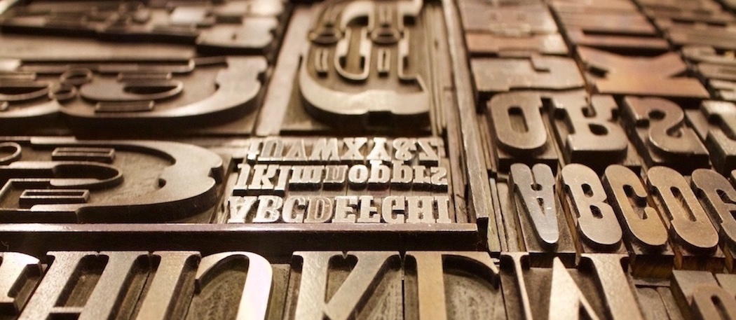 We’ve all been there before! A client has a new ad they want to run and they want you to use the same font that was used as a headline in a previous piece. The client provides an image of the prior ad but doesn’t have any of the original files for you to use. This can sometimes be a difficult task, particularly, when it’s not a commonly used font like Helvetica, Avant Garde, Times New Roman or Garamond. So how can you track down a font if you don’t have a clue as to its name? Fortunately, there are a few sites to help you with that. Check out a few examples listed below to help make your search a little easier. One thing to remember is there’s no magic bullet even with the amount of resources these sites can provide. When these sites don’t have the answer you are looking for, you may need to still scour the font collections of Google, Linotype or Adobe to name a few.


