ARIAL VERSUS HELVETICA
Every typeface, like every one of us, has its distinguishing features. You might be forgiven for thinking that some fonts are clones, or identical twins. However, closer inspection reveals subtle differences and nuances that simply escape casual perusal. Something that can really help heighten our sensitivity to those differences is getting out our magnifying glasses and really taking a closer look.
Today we’re going to de-robe two popular typefaces, namely Arial and Helvetica — faces that are often confused, and often the subjects of mistaken identity. But first let me re-introduce you to these two popular faces:
Helvetica
Designed in 1957 by Max Miedinger, Helvetica’s design is based on that of Akzidenz Grotesk (1896), and classified as a Grotesque or Transitional san serif face. Originally it was called Neue Haas Grotesque; in 1960 it was revised and renamed Helvetica (Latin for “Swiss”).
Arial
Designed in 1982 by Robin Nicholas and Patricia Saunders for Monotype (not Microsoft), it’s classified as Neo Grotesque, was originally called Sonoran San Serif, and was designed for IBM’s bitmap font laser printers. It was first supplied with Windows 3.1 (1992) and was one of the core fonts in all subsequent versions of Windows until Vista, when to all intents and purposes, it was replaced with Calibri.
Arial and Helvetica share a more consistent, even stroke width. I guess it depends on whether one is looking at the form or the appearance.

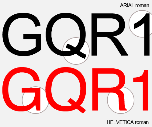
A number of the glyphs are almost identical, and even an expert would have difficulty telling them apart. However, there are a few that stand out as being quite different; namely “a”, “G”, “Q”, “R”, and “1”. Did you spot any other differences or identifying marks?
In fact if you wish to quickly differentiate any font from from another, it’s usually best to begin by looking at letters like “J”, “Q” and “g”.

What it’s wrong to do is criticize Arial as a clone or rip-off of Helvetica. If Arial is a rip-off of Helvetica, then Helvetica is a rip-off of Akzidenz Grotesk; or we could simply say that they are both rip-offs of earlier Grotesque faces. The whole rip-off debate is a rather pointless one, I feel. Every face should be considered on its own merit. (We don’t criticize a daughter for looking like her mother). And, if you want to criticize Arial (it certainly has its faults), then do so, not because everyone else does, but do so with your own critical eye.